
Role: UX Lead & Product Art Director
Team: Vendor UI/UX Designer
Company: Gazeus Games
Tools: Figma
Platform: iOS, Android, Facebook Instant Games
Stakeholders: Product Manager, Game Designer, Developers, QA
Skills: UX leadership, UX Design, UI Design, Art Direction
Product info
Dominoes Battle is a competitive mobile dominos game with an established player base across three platforms.
Developer: Gazeus Games.
Target audience
The game serves a broad audience of casual and mid-core mobile players who enjoy classic board games. For this feature specifically, the key behavioral consideration was designing for players with varying levels of engagement – from casual daily visitors to invested players who learn the game’s systems through play.
Feature: Daily Missions
The task: Design a Daily Missions feature – a persistent engagement loop intended to build healthy play habits and bring players back every day.
My role spanned the full design process: translating a game design document into a UX and UI Design tasks to become a clear UX flow and UI that aligns with the game style, directing and reviewing the work of a vendor designer, and keeping a multi-disciplinary stakeholder group aligned throughout.
The Challenge
The feature had several layers of complexity that made it more than a typical UI/UX task.
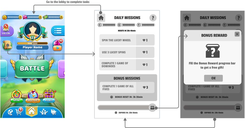
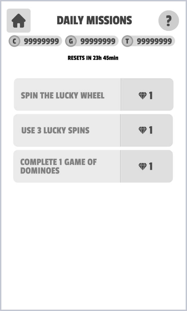
The game design document defined three mission tiers – a fixed daily set of 3 missions, a rotating 4-hour bonus mission, and a long-term bonus reward that accumulates progress over 5 days – each with distinct reset logic, states, and reward behaviours. Getting all of that to read clearly in a single screen without overwhelming the player was the central UX problem.
On top of that, the project involved coordinating across a vendor designer who needed clear, structured direction, and a stakeholder group with different priorities: the game designer cared about preserving the feature’s meta depth (notably, progress values were intentionally hidden to reward engaged players), the PM cared about schedule and scope, and developers needed decisions documented precisely enough to implement without ambiguity.
WORK PROCESS
Reading the GDD as a UX Document
Before any wireframes, I went through the game design document to extract the design decisions buried in it, like understanding why progress values were hidden from players and what that meant for how the mission cards needed to feel.
Directing the Vendor Designer
I worked directly with the vendor UI/UX designer through iterative review cycles.
I structured each review cycle with a written scope, annotated feedback, and shared visual references so the collaboration stayed directed and the designer always had something concrete to act on.
Stakeholder Alignment
I kept one document that tracked every screen state, reset rule, and flow decision, so developers, QA, and the PM always had the same information to reference – and when the team disagreed on how the bonus chest should behave, I tied the decision back to what the player would understand, which made it easier to agree and move on.
KEY DESIGN DECISIONS
- Dedicated screen over popup. The brief was explicit that Daily Missions should live on their own screen, not appear as a popup. This was the right call: a dedicated screen gives the feature the weight it deserves and allows players to engage with it deliberately rather than dismissing it as interruption.
- Visual hierarchy across three mission tiers. The screen needed to communicate that daily missions and the bonus mission are distinct in nature – one is fixed and mandatory, the other rotates and expires. I used section labeling, visual separation, and the countdown timer to make the distinction immediately readable without requiring players to read explanatory copy.
- Bonus reward as persistent ambient progress. The chest + progress bar at the bottom of the screen functions as a long-horizon motivator that sits beneath the daily loop. Keeping it always visible – but never shouting – reinforces the sense that every mission completed is building toward something, without competing with the primary mission content above it.
Phasing the Feature
After aligning on the full design, the team decided to launch an MVP version scoped to daily tasks only, with bonus missions deferred to a later phase.
Launching with a simpler flow reduced implementation risk by cutting down the number of edge cases and component states the dev team had to handle in one release.
It also gave the team a cleaner opportunity to test how players engaged with the feature before adding another layer of reward logic on top — collecting real usage data first meant any decisions about the bonus system could be informed by actual behaviour rather than assumptions.
With a vendor designer and multiple stakeholders involved, the tighter scope also helped keep the project on track without mid-phase changes pulling the work in different directions.
To view UX/UI Design, please use the password found in my resume or reach out via LinkedIn.
The design was handed off implementation-ready before I left the company. The MVP scope, documentation, and phased structure were set up to give the team a clean path to launch and a foundation to build the full feature on.
REFLECTION
This project was a good example of what UX leadership looks like in a game studio context: less about making every design decision yourself and more about creating the conditions for good decisions to happen – through clear framing, structured vendor direction, and consistent stakeholder communication. The feature’s logic was genuinely complex under the hood, and the main design challenge was making that complexity feel effortless to the player.